Lecture 8: Balance Property & Auto-calibration
Deep Learning for Actuarial Modeling
36th International Summer School SAA
University of Lausanne
36th International Summer School SAA
University of Lausanne
Abstract
This lecture discusses unbiasedness, the balance property and auto-calibration which all refer to model calibration. These are important properties in financial applications to ensure that prices are correct on average.
1 Unbiasedness and the balance property
Generally, unbiasedness is an important property in actuarial pricing, regardless of what specific meaning one underpins unbiasedness.
An in-sample bias needs to be avoided in model selection, otherwise the predictor generalizes poorly to new data.
An estimated regression model should be void of a statistical bias to ensure that the average price level is correctly specified.
Most regression models include an intercept; see GLM lecture. This intercept is called bias term in the machine learning literature.
There is some concern about unfair discrimination in insurance pricing, and algorithmic decision making more generally. Any kind of unfair treatment of individuals or groups with similar features is related to a bias, coined unfair discrimination bias.
1.1 Global (statistical) unbiasedness
An estimated model \(\widehat{\mu}_{\cal L}\), being fitted on a learning sample \({\cal L}=(Y_i,\boldsymbol{X}_i, v_i)_{i=1}^n\), is (globally/statistically) unbiased if \[ {\mathbb E}\left[v\widehat{\mu}_{\cal L}(\boldsymbol{X})\right] = {\mathbb E}[vY],\] assuming that \((Y,\boldsymbol{X},v)\) is independent of \({\cal L}\).
This unbiasedness is out-of-sample.
Verification of unbiasedness needs knowledge of the mean \({\mathbb E}[vY]\); and the possibility to re-sample \({\cal L}\) and \((\boldsymbol{X},v)\) for an empirical verification.
There are various conditional versions.
1.2 The balance property
Definition. A regression model fitting procedure \({\cal L} \mapsto \widehat{\mu}_{\cal L}\) satisfies the balance property if for almost every realization of the learning sample \({\cal L}=(Y_i,\boldsymbol{X}_i, v_i)_{i=1}^n\), the following identity holds \[ \sum_{i=1}^n v_i\, \widehat{\mu}_{\cal L}(\boldsymbol{X}_i) = \sum_{i=1}^n v_iY_i.\]
The balance property is an in-sample property that is easy to verify; Bühlmann and Gisler (2005) and Lindholm and Wüthrich (2024).
It does not require the knowledge of the true mean \({\mathbb E}[vY]\).
The balance property is a re-allocation of the total portfolio claim.
Mathematical result. MLE estimated GLMs using the canonical link comply with the balance property (if and only if w.r.t. the canonical link choice).
If the balance property is not fulfilled, a correction should be applied. In most cases, one adjusts the bias term/intercept correspondingly.
A correction may also be necessary if the future claims level changes, e.g., because of non-stationarity/inflation.
Under the canonial link choice, there are ways to rectify the balance property within neural networks; see notebooks of Wüthrich et al. (2025).
2 Auto-calibration
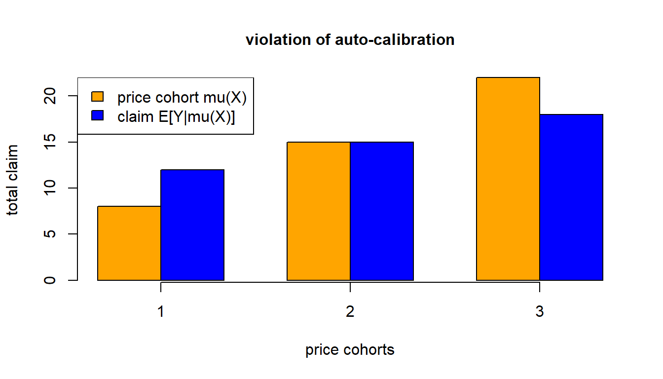
Definition. A regression function \(\mu:{\cal X}\to {\mathbb R}\) is auto-calibrated for \((Y,\boldsymbol{X})\) if, a.s., \[ \mu(\boldsymbol{X}) = {\mathbb E} \left[ \left. Y \right| \mu(\boldsymbol{X}) \right].\]
Auto-calibration implies that every price cohort \(\mu(\boldsymbol{X})\) is on average self-financing for its corresponding claims \(Y\).
Auto-calibrated pricing schemes avoid systematic cross-financing.
The following example shows a violation of auto-calibration.
- Price cohort 1 is systematically cross-financed by price cohort 3.
2.1 MTPL GLM example, revisited: auto-calibration
# we construct an actual vs. predicted plot - decile binning

# decile binning (out-of-sample on test data)
test$freq <- test$GLM/test$Exposure  # GLM predictor from previous lecture
qq <- quantile(test$freq, probs = c(0:10)/10)
test$qq <- 1
for (t0 in 2:10){test$qq <- test$qq + as.integer(test$freq>qq[t0])}
dd <- data.frame(test %>%  group_by(qq) %>%
                           summarize(yy = sum(ClaimNb),
                                     mm = sum(GLM),
                                     vv = sum(Exposure)))
#
dd$yy <- dd$yy/dd$vv  # bin averages    -> y-axis of next graph (actuals)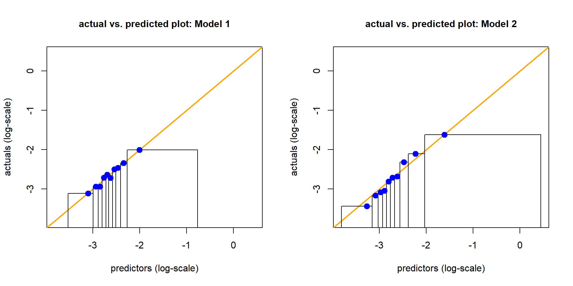
dd$mm <- dd$mm/dd$vv # bin barycenters -> x-axis (predictor averages)- Actual vs. predicted plot using decile binning
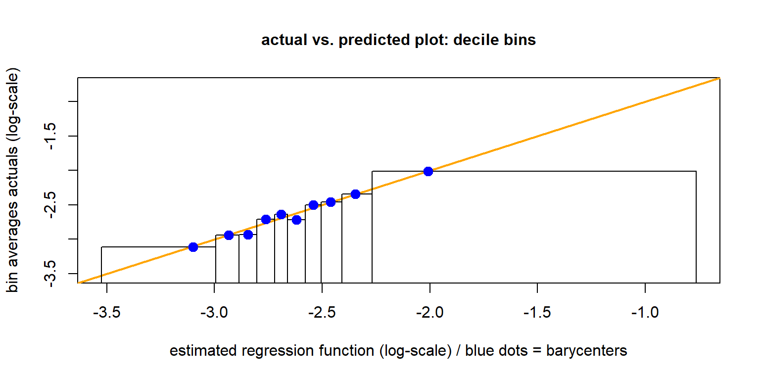
- Observe the non-monotonicity.
- Is this auto-calibrated: are the blue dots on the orange diagonal?
Actual vs. predicted plot
The above plot is known as actual vs. predicted plot.
One plots the observations (actuals) \(Y\) on the \(y\)-axis against the predictors \(\widehat{\mu}(\boldsymbol{X})\) on the \(x\)-axis.
To reduce volatility, one performs quantile binning w.r.t. the predictors \(\widehat{\mu}(\boldsymbol{X})\), and one builds empirical means on these bins for predictors and responses.
The rectangles show the decile bounds, the \(x\)-values of the blue dots corresponds to the barycenters of the predictors in these decile bins.
Often, for a more meaningful plot, one plots the axes on the log-scale.
If the regression function \(\widehat{\mu}(\cdot)\) has been estimated on a learning sample \({\cal L}\), this plot should be performed on the test sample \({\cal T}\).
2.2 Local regression
The local regression of Loader (1999) gives a smooth version of the previous actual vs. predicted plot.
For the local regression \(Y_i \sim X_i:=\widehat{\mu}^{\rm GLM}(\boldsymbol{X}_i)\) we use quadratic splines. The bandwidth \(\delta(X_i)\) is chosen such that the smoothing window \(\Delta(X_i)\) contains a nearest neighbor fraction of \(\alpha=10\%\) of the data.
For details, see the notebooks of Wüthrich et al. (2025).
## we construct an actual vs. predicted plot - local regression
suppressMessages(library(locfit))

### local regression approach
set.seed(100)
# select only finitely many samples for the following plot (illustration)
kk <- sample(c(1:nrow(test)), size=1000)
# local regression fit
spline0 <- predict(
             locfit(test$ClaimNb/test$Exposure ~ test$freq,
                               weights=test$Exposure,
                               alpha=0.1, deg=2),
newdata=test[kk,]$freq)- This is illustrated in the next graph.
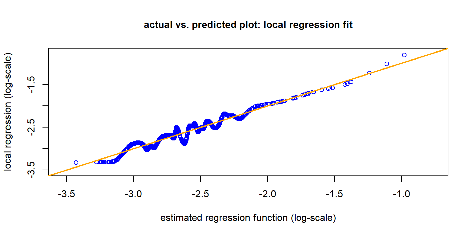
The hyper-parameters of the nearest neighbor fraction \(\alpha \in (0,1]\) and the degree of the splines have a crucial influence on the results.
The tails seem fine, but the fluctuation in the middle are quite large.
Isotonic regression is a more robust alternative.
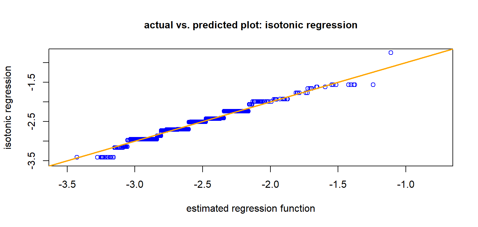
This is a monotone regression, not requiring hyper-parameter tuning. Over-fitting at both ends of the graph should be taken care off.
Graph seems to support auto-calibration, except may be in the tails.
The blue graph is (empirically) auto-calibrated!
3 Lift plots
Lift plots/lift charts compare regression models.
We select a second regression model.
## 2nd Poisson log-link GLM with different covariates (we drop AreaGLM, and we add BonusMalusGLM and VehAgeGLM compared to the previous GLM)

d.glm2  <- glm(ClaimNb ~ DrivAgeGLM + BonusMalusGLM + VehBrand + VehGas + DensityGLM + VehAgeGLM, data=learn, offset=log(Exposure), family=poisson())

## predict in-sample and out-of-sample
learn$GLM2 <- predict(d.glm2, newdata=learn, type="response")
test$GLM2  <- predict(d.glm2, newdata=test,  type="response")
3.1 In-sample and out-of-sample Poisson deviance losses
Poisson.Deviance <- function(pred, obs, weights){  # scaled with 100
  100*2*(sum(pred)-sum(obs)+sum(log((obs/pred)^(obs))))/sum(weights)}

# 1st GLM (in- and out-of-sample losses)
round(c(Poisson.Deviance(learn$GLM, learn$ClaimNb, learn$Exposure), Poisson.Deviance(test$GLM, test$ClaimNb, test$Exposure)), 3)
[1] 46.954 47.179# 2nd GLM (in- and out-of-sample losses)
round(c(Poisson.Deviance(learn$GLM2, learn$ClaimNb, learn$Exposure), Poisson.Deviance(test$GLM2, test$ClaimNb, test$Exposure)), 3)[1] 45.706 45.669- It seems that the second GLM is better. Can we verify this?
3.2 Actual vs. predicted plot using decile binning
From these plots it is difficult to draw conclusions about model selection.
3.3 Lift plot
A lift plot shows the same statistics in a different graph: it plots the binned prediction averages and the binned response averages both on the \(y\)-axis, against the bin labels on the \(x\)-axis.
There is the following interpretation; see Goldburd et al. (2020).
Auto-calibration: The predictors (orange circles) and the actuals (blue triangles) should approximately coincide; see next graph.
Monotonicity. The actuals (blue triangles) should be monotone under auto-calibration (up to the pure noise).
Discrimination. The better the regression model can discriminate the claims, the bigger the difference between the lowest and the highest quantiles; this is called the lift.
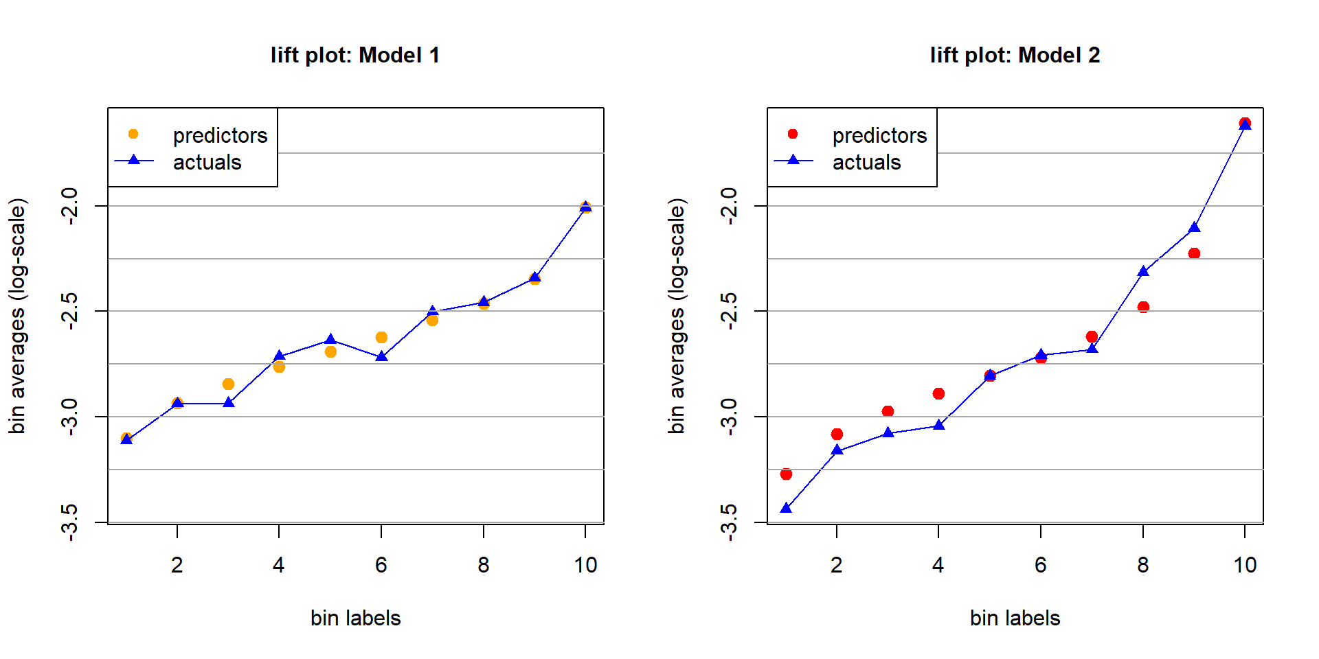
Auto-calibration. Model 1 seems better auto-calibrated than Model 2.
Monotonicity. Model 2 provides monotonicity, Model 1 does not.
Discrimination. Model 2 has a clearly bigger lift than Model 1.
3.4 Double lift chart
A double lift chart considers both regression models in the same graph.
Assume that all predictions are strictly positive.
Out-of-sample predictions of Model 1 and 2: \((\widehat{\mu}_k(\boldsymbol{X}_t))_{t=1}^m\), \(k=1,2\).
Compute the ratios \[ \kappa_t = \frac{\widehat{\mu}_2(\boldsymbol{X}_t)}{\widehat{\mu}_1(\boldsymbol{X}_t)} \qquad \text{ for $1\le t \le m$.}\]
Use the ratios \((\kappa_t)_{t=1}^m\) for quantile binning:
- Smallest bin: Model 2 judges the risks more positively than Model 1.
- Largest bin: Model 2 judges the risks more negatively than Model 1.
# decile binning for the double lift chart (out-of-sample on test data)
test$DL <- test$GLM2/test$GLM
qq <- quantile(test$DL, probs = c(0:10)/10)

test$qq <- 1
for (t0 in 2:10){test$qq <- test$qq + as.integer(test$DL>qq[t0])}
dd <- data.frame(test %>%  group_by(qq) %>%
                           summarize(yy = sum(ClaimNb),
                                     mm1 = sum(GLM),
                                     mm2 = sum(GLM2),
                                     vv = sum(Exposure)))
#
dd$yy  <- dd$yy/dd$vv     # bin averages actuals
dd$mm1 <- dd$mm1/dd$vv    # bin predictor GLM1
dd$mm2 <- dd$mm2/dd$vv    # bin predictor GLM2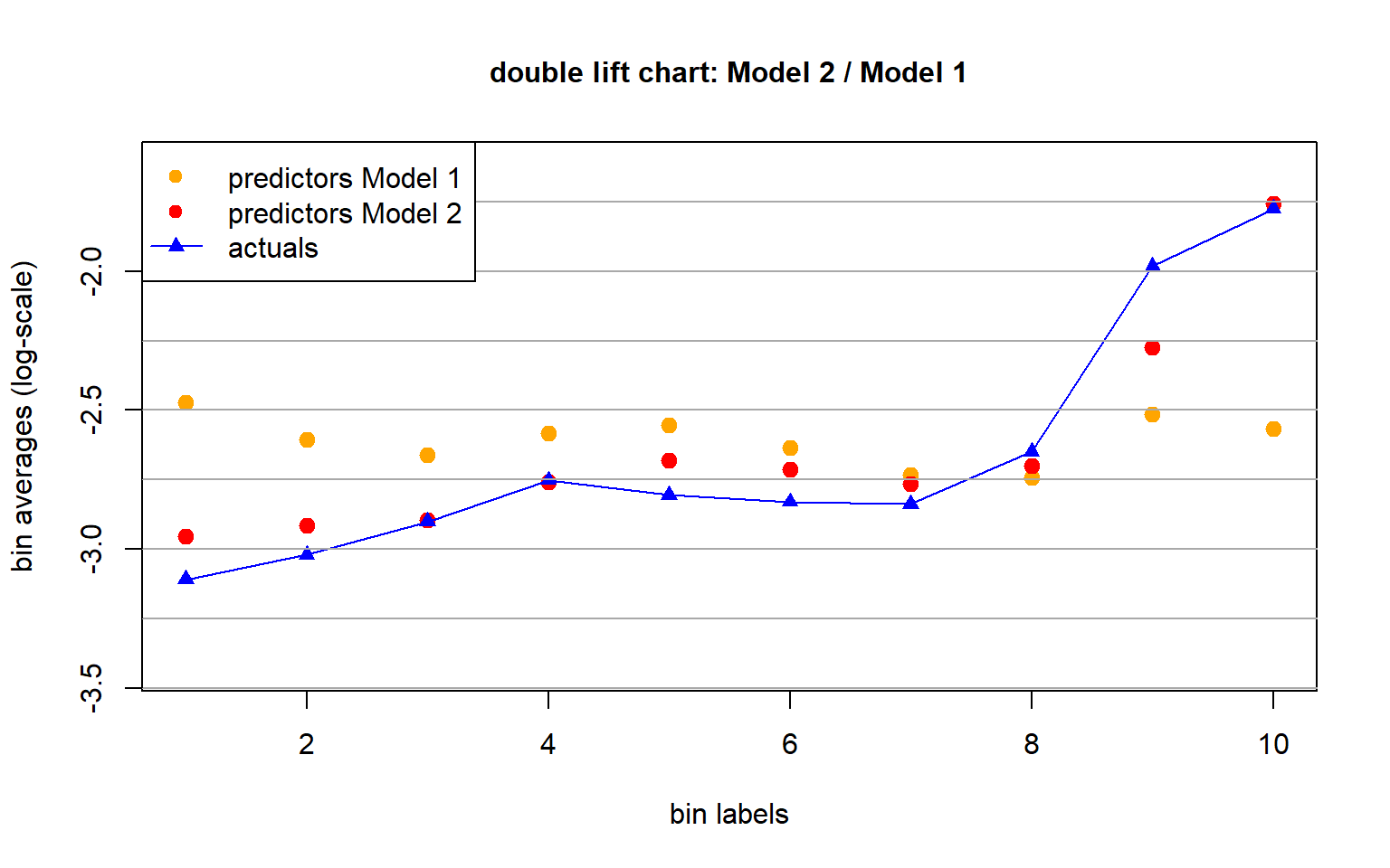
- Based on this double lift chart we give preference to Model 2.
4 Appendix: Murphy’s score decomposition
Choose a strictly consistent loss function \(L\) for mean estimation.
Murphy (1973)’s score decomposition is given by \[ {\mathbb E} \left[ L(Y, {\mu}(\boldsymbol{X}))\right] ~=~ {\sf UNC}_L - {\sf DSC}_L +{\sf MSC}_L,\] with uncertainty, discrimination (resolution) and miscalibration defined by, respectively, \[\begin{eqnarray*} {\sf UNC}_L &= & {\mathbb E} \left[ L\left(Y, \mu_0 \right)\right] ~\ge~0, \\ {\sf DSC}_L &= & {\mathbb E} \left[ L\left(Y, \mu_0 \right)\right] -{\mathbb E} \left[ L\left(Y , {\mu}_{\rm rc}(\boldsymbol{X}) \right)\right]~\ge~0, \\ {\sf MSC}_L &= & {\mathbb E} \left[ L \left(Y, {\mu}(\boldsymbol{X}) \right)\right] -{\mathbb E} \left[L \left(Y, {\mu}_{\rm rc}(\boldsymbol{X}) \right)\right]~\ge~0. \end{eqnarray*}\]
from model_diagnostics.scoring import (
    PoissonDeviance,
    decompose,
    HomogeneousExpectileScore,
)
from model_diagnostics.calibration import compute_bias

scoring_function = PoissonDeviance()
scoring_function = HomogeneousExpectileScore(degree=1.000000001, level=0.5)
df_pred_test = pd.DataFrame({"GLM_2": test["GLM_2"], "GLM": test["GLM"]})
y_test = test["ClaimNb"] / test["Exposure"]
df = decompose(
    y_obs=y_test,
    y_pred=df_pred_test,
    scoring_function=scoring_function,
    weights=test["Exposure"],
)
df.sort(["score"])- Results of Murphy’s score decomposition using the Poisson deviance loss as scoring function.

- GLM2 has a (much) better discrimination, but the miscalibration needs to be improved to avoid systematic cross-financing within the portfolio, i.e., GLM2 has an auto-calibration issue that needs to be improved.
Copyright
© The Authors
This notebook and these slides are part of the project “AI Tools for Actuaries”. The lecture notes can be downloaded from:
https://papers.ssrn.com/sol3/papers.cfm?abstract_id=5162304
\(\,\)
- This material is provided to reusers to distribute, remix, adapt, and build upon the material in any medium or format for noncommercial purposes only, and only so long as attribution and credit is given to the original authors and source, and if you indicate if changes were made. This aligns with the Creative Commons Attribution 4.0 International License CC BY-NC.
References
Bühlmann, H. and Gisler, A. (2005) A course in credibility theory and its applications. Springer. Available at: https://doi.org/10.1007/3-540-29273-X.
Goldburd, M. et al. (2020) Generalized linear models for insurance rating. 2nd ed. Casualty Actuarial Society (CAS monograph series, 5). Available at: https://www.casact.org/sites/default/files/2021-01/05-Goldburd-Khare-Tevet.pdf.
Lindholm, M. and Wüthrich, M.V. (2024) “The balance property in insurance pricing.” Available at: https://ssrn.com/abstract=4925165.
Loader, C. (1999) Local regression and likelihood. Springer. Available at: https://doi.org/10.1007/b98858.
Murphy, A.H. (1973) “A new vector partition of the probability score,” Journal of Applied Meteorology and Climatology, 12(4), pp. 595–600. Available at: https://journals.ametsoc.org/view/journals/apme/12/4/1520-0450_1973_012_0595_anvpot_2_0_co_2.xml.
Wüthrich, M.V. et al. (2025) “AI Tools for Actuaries,” SSRN Manuscript [Preprint]. Available at: https://papers.ssrn.com/sol3/papers.cfm?abstract_id=5162304.